Microsoft Design Tools
UNI
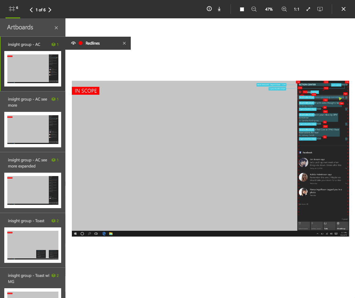
UNI is an internal platform that optimizes workflow and syncs design files and assets for design teams and organizations. UNI aims to be the single source of truth for Microsoft design thinking, enabling cross-team visibility, knowledge share and consistency.
IconCloud
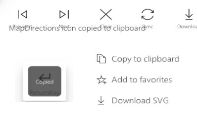
Three icon libraries (UNI Icon Library, Fabric Icon Library, Office UI Icon Library) converge in the IconCloud, which allows designers & engineers can browse and search across all icon sets, copy and paste into any design application, and download icons as a fonts, SVG, PNG.
UNI
Card Re-Design
Microsoft designers upload their files on UNI. The files are created by different design tools, and UNI supports all modern design applications and formats such as Figma, Sketch, Adobe Suites, and so on.
Previous Card Elements
Thumbnail Image: Displaying the first image in art board
Title: Two lines are maximum. If more, it shows …
Description: Two lines are maximum. If more, it shows …
Tags: Navigate to a page which contains related files
File Status: Delivered with green color vs Working with yellow color
File Type: Show an icon
Processing File: UNI shows “processing file icon” if system has problems to display the image
User Feedback
1. Users would like to have an option to go “Quick view” or “Design view” since current cards always navigate to “Quick view”
2. They want to see information on cards regarding who has modified a file and when a file has been modified lately.
3. File status isn’t enough to stand out
4. File type icons are not latest (ex.there is no Adobe XD icon)
5. Want to see file names on cards with file types (some users search a file by file name not title)
6. They want to see more cards on their screen. (There are limited cards displayed due to left navigation and card size)
Design Suggestion
Make status bar more stand out
Options navigating to quick view & design view
File name and extension
User profile with file modified time
Latest icon
Processing icon
Lock icon for users who need a permission to see the file
Some file types (PPT, Word, Excel and so on) are displayed on half card since there is no art
System error
Refine Menu
Users Feedback on Previous Refinement Menu
Refinement menu takes too much space on the screen. It limited the number of cards displayed.
Each refinement filter doesn’t match to the information on the cards.
Users can not see all the filters at once since each refinement filter comes out in order (Product > Project > Feature Area…)
Design Suggestion
Refinement menus stays on the top so that users can filter whenever they want to
Left navigation is collapsed as default for displaying more cards
Filters at the top matches to the information on the cards.
New UNI
Goals
Encourage Microsoft designers & developers to increase the use of UNI.
Figma integration is allowed in UNI
Increase accessibility (Users are able to find a file faster and easier than before)
New File Structure
Product Gallery : Serves as the Home Page and is a collection of products in UNI
Product Page: Related designs and assets within a specific design team organized by product
Feature Page: A category containing like design assets that showcase historical evolution, grouped by milestones
Cards: All design assets created for a specific Feature category
Product Gallery
Breadcrumb: Always informs you where you are within the hierarchy
Global Filter: Refine and customize what you want to view on the screen (Refine results by ‘Design Team’, ‘Products’, ‘File Status’, ‘File Types’, ‘Authors’)
Title Banner: Indicates where you are in the hierarchy
Grid View vs. List View: Toggle between views to view Products represented by cards with Grid View or more detail in List View showcasing Latest Delivered files.
Product Card: Each product is represented on a card
Pinning: Save products in personal page by pinning
Grid View
List View
Video
Product Page
Breadcrumb: Always informs you where you are within the hierarchy
Global Filter: Refine and customize what you want to view on the screen (Refine results by ‘File Status’, ‘File Types’, ‘Authors’)
Title Banner: Indicates where you are in the hierarchy (Selected product)
Grid View vs. List View: Toggle between views to view Products represented by cards with Grid View or more detail in List View showcasing Latest Delivered files.
Pinning: Save products in personal page by pinning
Syncing OneDrive: Up to date latest file by syncing
Latest Delivered File: The page displays the latest delivered files at the top
Feature Card: Thumbnail images of saved files are represented on a feature card
Grid View
List View
Video
Feature Page
Milestones: If your product aligns to milestones, these are defined in the organized hierarchy structure. In OneDrive these are represented by folders.
Cards: Represent an individual design or asset. Each card is marked with either a Delivered (POR, ready to code) or Working (Work in progress) status badge. There is no guesswork now on what the latest and greatest design is.
Video
IconCloud
IconCloud is an integrated platform of three Icon Libraries, UNI, Fabric, Office UI Icon Library. It helps users conveniently browse and search across all icon sets based on their purpose. Converge three tools (UNI, Fabric, Office UI Icon Library) to create a single tool for all fonts and glyphs. Designers and engineers can browse and search across all icon sets, copy and paste into any design application and download icons as a fonts, SVG, PNG or Zip. Users can choose their icon size and pick light or dark theme.
User Stories
As a user, I want to be able to browse IconCloud and see a list of all fonts and icon sets
As a user, I want to be able to search for icons by friendly name across multiple icon sets globally
As a user, I want to be able to copy & paste icons directly into any design application (ex. Figma/Sketch/XD)
As a user, I want to be able to download icons as a font, svg, png, or zip in any size and in light or dark theme
As a user, I want to be able to multi-select before I copy & paste or download
As a user, I want to be able to copy multi-select icons and paste into any design application
As a user, I want to be able to control the size of icons
As a user, I want to be able to download fonts
Comparison
Browsing
User Story 1: As a user, I want to be able to browse IconCloud and see a list of all fonts and icon sets
User Story 2: As a user, I want to be able to search for icons by friendly name across multiple icon sets globally
Copy, Paste, and Download
User Story 1: As a user, I want to be able to copy & paste icons directly into any design application (ex. Figma/Sketch/XD)
User Story 2: As a user, I want to be able to download icons as a font, svg, png, or zip in any size and in light or dark theme
Multi-select icons
User Story 1: As a user, I want to be able to multi-select before I copy & paste or download
User Story 2: As a user, I want to be able to copy multi-select icons and paste into any design application
Control the Size of Icons
User Story 1: As a user, I want to be able to control the size of icons
Font & Code
User Story 1: As a user, I want to be able to download fonts
Brainstorming
Key Features of IconCloud
IconCloud shows all the icons under a masters fonts (Full MDL2) as a default, and IconCloud has an option for sorting by subset fonts so that it allows a user to browse icons in her/his own font sets
Mouse right click to open the copy options
Ctrl/Command + C to copy selected icons as SVG and feedback test responding to the action appears at the top
IconCloud has multi select options
Shift + Click
Ctrl/Command + Click
Define Areas with mouse to select icons
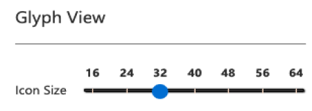
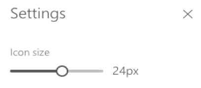
IconCloud has the controller for changing icon size & style, selecting light & dark theme.
Download icons, Master fonts, or subset fonts in different file types
Finalized User Stories & Design
1. As a User, I want to view icons on the Home Page
Home Page Loading
Page Resolution (1600x1044)
Page Resolution (1030x1044)
2. As a User, I want to search for icons by friendly name across multiple icons sets globally
Search Favorite (There are 17 Search Results)
Search abcdef (There is no result)
3. As a User, I want to change the Master Font and/or choose a Subset Font
Font Menu DropDown
Select one of the subset fonts
Icon Tab without selecting icons
4. As a User, I want to view the Font Directory and a list of Subset fonts
Fonts Directory Page
Select one of the subset fonts
Icon Tab without selecting icons
5. As a User, I want to view icons in different sizes and view icons in dark and light theme
64px
40px
16px
56px
32px
8px
48px
24px
Black Theme
6. As a User, I want to copy/paste icon(s) directly into Figma/Sketch/XD with the file type I choose
Select Single Icon
Open Secondary Copy Options
Copy Glyph
Click Copy Icon to Copy Friendly Name, Unicode, Keywords
Hover on an Icon
Mouse Right Click
Click Copy Glyph
Multi-Selected Icons with Scroll Bar
7. As a User I want to download icons as an svg, png or zip (when multiple)
Select Single Icon
Single Selected Icon Download
Multi-Select Icons
Multi-Select Icons Download
Multi-Selected Icons with Scroll Bar
8. As a User, I want to download a font and view font details
Home (1600x1044)
Download Fonts
Subset Font Page
9. As a User, I want to view details about an icon and link to other subset fonts containing the same icon
Select Single Icon
Multi-Select Icons
Select Single Icon with Scroll
10. As a User, I want to report a bug, share feedback and visit help center
Home (1600x1044)
Modal - Submit Feedback 1
Modal - Submit Feedback 3
Mouse Hover
Modal - Submit Feedback (Blank Field)
Modal - Report a Bug 4
Click Options
Modal - Submit Feedback 2
Modal - Submit Feedback 4.1


